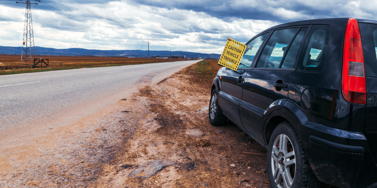

When creating safety graphics that demand attention, the foundation lies in crafting visuals that communicate urgency at a glance. A danger sign is not merely a panel with bold letters—it is a precisely engineered visual alert that uses targeted hues, intentional contrast, and impeccable clarity to convey a simple, vital instruction. These design choices can quite literally influence outcomes in high-stakes moments. In environments where every second matters, integrating emergency signs with these principles ensures warnings are both noticed and understood instantly.
Understanding the Role of Color in Safety Signage
The Psychology of Safety Colors
In hazard communication, color is not decorative—it is functional. Red, for instance, instantly triggers a psychological response associated with stopping, warning, or identifying critical risks. This is why it dominates the visual landscape of any danger sign. Yellow, used often in emergency signs, signals caution and heightened awareness without inducing the immediate alarm of red. Blue and green, though less urgent, offer complementary guidance, directing users toward instructions or safe zones.
Cultural and Industry Standards
Designers cannot simply select a shade based on personal preference; safety color standards are set by governing bodies such as ANSI (American National Standards Institute) and ISO (International Organization for Standardization). A red hue in a hazard panel is not just “red”—it is a precise Pantone or RGB specification to ensure consistency. These standards are essential to universal recognition, allowing anyone—regardless of language or location—to interpret the message.
Mastering Contrast for Maximum Visibility
The Power of High Contrast
Even the most strategically chosen color palette will fail if contrast is insufficient. High contrast between text and background makes content legible from greater distances and in varied lighting. For example, a black “DANGER” text over a pure white block, framed in red, creates an unmistakable signal. Similarly, emergency signs benefit from white or yellow text against a deep blue or green field, enabling rapid comprehension.
Real-World Environmental Testing
An ideal design phase involves testing the sign in multiple environments: bright daylight, shadowed corridors, artificial lighting, and low-light conditions. This ensures the sign retains legibility regardless of glare, shadow, or distance. Designers must account for color-blind viewers as well, adjusting contrast ratios to maintain visual accessibility.
Typography: The Voice of the Danger Sign
Font Selection for Clarity
Typography transforms visual shapes into meaning. Sans-serif fonts dominate the safety sign space due to their clean, unembellished forms, which maintain clarity at a glance. Overly stylized typefaces compromise legibility, particularly in urgent situations. Letter height, spacing, and stroke weight must be optimized for maximum recognition.
Hierarchy of Information
The most critical message—such as “DANGER” or “WARNING”—should occupy the most prominent space. Supporting text should be secondary but still readable. For danger sign layouts, the primary word is often in uppercase, bold, and centered, with supplemental details in slightly smaller text underneath.
Symbolism and Iconography
Why Icons Matter
Icons transcend language barriers and can be recognized instantly, even before reading the text. A skull-and-crossbones or high-voltage lightning bolt is universally understood as a hazard marker. For emergency signs , icons like arrows, exit doors, or medical crosses communicate actionable directions swiftly.
Consistency Across Platforms
Once selected, icons must be scaled appropriately, ensuring they remain crisp whether on a handheld panel or a building-wide closet. Pixelation or distortion reduces credibility and undermines trust in the message.
Material and Finish Considerations
Durability in Harsh Environments
A perfect design is useless if the substrate degrades quickly. For danger sign applications in industrial sites, weatherproof metals, UV-resistant inks, and anti-fade coatings are essential. Indoor emergency signs may use lightweight plastics, but must still withstand cleaning chemicals and potential impacts.
Reflectivity and Illumination
In low-light environments, reflective coatings or built-in illumination transform a passive panel into an active alert. Photoluminescent materials can absorb ambient light and glow during blackouts—ideal for critical safety pathways.
Legal Compliance and Risk Management
Regulatory Frameworks
Failure to comply with safety signage laws can result in legal liability. Designers should be aware of OSHA regulations in the United States, or equivalent bodies internationally, which specify danger sign requirements including size, font, and positioning.
Proactive Safety Culture
Beyond mere compliance, well-designed emergency signs signal that an organization values preparedness and human safety. This fosters trust among employees, visitors, and clients.
Testing and Iteration
Field Trials
Before final production, prototype signs should be placed in their intended environments and observed for effectiveness. Are they noticed immediately? Can they be read at the intended distance? Are colors distinguishable under all lighting conditions?
Feedback Loops
Gathering feedback from current users ensures the sign's impact matches the designer's intent. Adjustments might include bolder typography, repositioning for better sightlines, or enhancing color vibrancy.
The Future of Safety Signage
Digital Integration
Advancements in technology are enabling interactive danger sign systems that change messages based on environmental sensors. For example, a digital panel could shift from “Caution” to “Danger” if conditions worsen.
Sustainability Considerations
Eco-friendly inks, recycled materials, and energy-efficient lighting are becoming standard in high-quality emergency signs , balancing safety with environmental responsibility.
Final Thoughts
Creating a high-impact danger sign is an intricate process that blends color psychology, contrast engineering, and typographic precision. It demands adherence to global standards, real-world testing, and a commitment to durability and accessibility. Whether crafting a standalone hazard alert or integrating it into a network of emergency signs , the goal remains constant: to deliver a message that is instantly seen, understood, and acted upon.