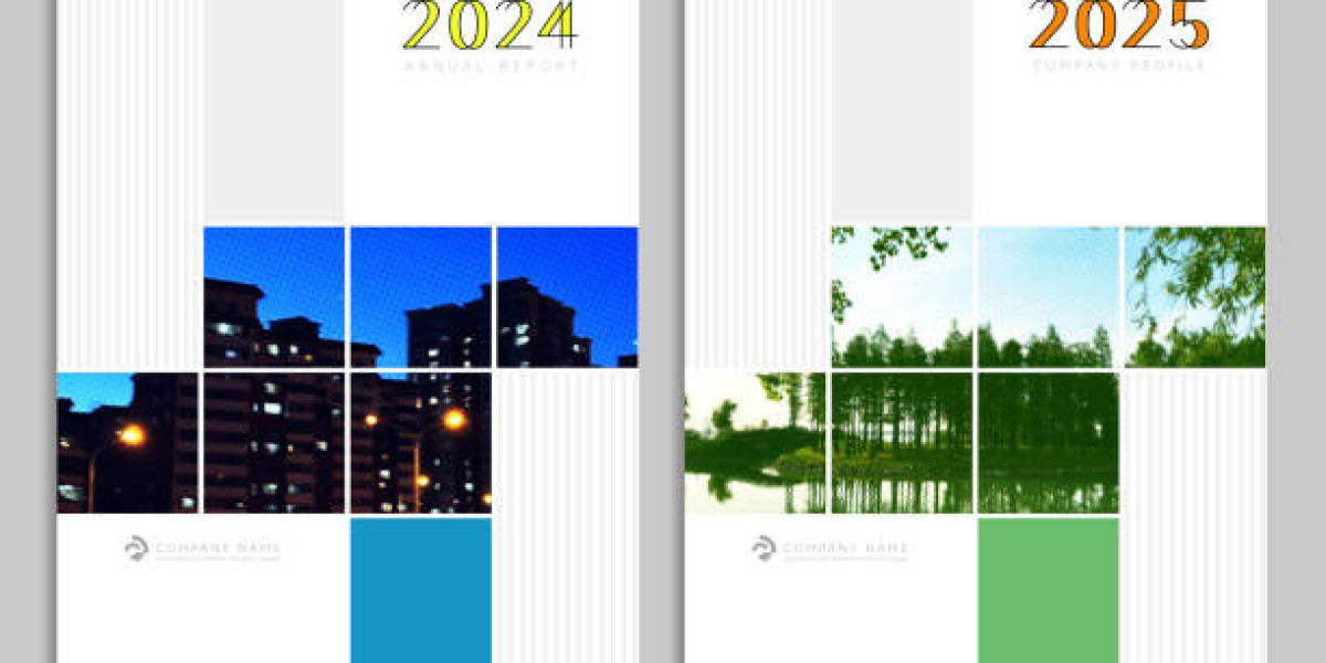

When it comes to annual report design, it's not just about complying with regulatory obligations—it’s a powerful chance to showcase your brand narrative, celebrate milestones, and engage stakeholders with compelling storytelling paired with smart visuals.
In today's fast-paced business environment, an annual report is more than a financial document—it's an opportunity to tell your story, reinforce your mission, and leave a lasting impression. But with attention spans getting shorter, how do you ensure your annual report gets read, appreciated, and remembered?
1. Prioritize Purposeful Storytelling
Annual report design should centre around narrative. Begin with a strong concept or 'theme' that threads through every page. Try asking your team: “What one word defines your year?” Anchor your design around that theme to ensure cohesion and emotional resonance.
2. Design with Your Readers in Mind
There’s typically one section readers revisit—like financials, milestones, or leadership insights. Make that section visually distinct with colour, icons, or layout tweaks to guide readers to the most important content.
3. Bring Achievements to Life
Don’t just list milestones—celebrate them. Inject personality into your achievements with infographics, timelines, "by-the-numbers" spreads, or illustrative storytelling that grabs attention and stays memorable.
4. Use Imagery That Speaks
A strong annual report design uses authentic imagery—real team members, behind-the-scenes snapshots, or metaphoric visuals—to reflect your culture and narrative.
5. Go Digital, Go Dynamic
In an increasingly mobile-first world, digital annual reports are a smart choice. They allow for interactivity like hover effects, embedded media, clickable menus, and animations, enhancing engagement while boosting accessibility and shareability.
6. Build a Strong Narrative Flow
Structure your report to guide readers seamlessly—whether you start with a CEO message or an achievements overview, maintain consistent headings, tone, and style to create momentum and coherence.
7. Visualize Data Clearly
Bold infographics, clean charts, and thematic icons turn dense data into digestible, brand-aligned visuals. When designed thoughtfully, data transforms from dry facts to persuasive storytelling.
8. Highlight Tangible Impact
Especially for NFPs or mission-driven organisations, illustrate how your work made a real difference—impact stories backed by visuals and metrics can significantly influence stakeholder engagement.
9. Create Shareable Summaries
Not every stakeholder will dig into a full-length report. Complement your annual report with a concise one-page summary or a short video to distil your message for broader sharing.
10. Launch Strategically Like a Campaign
Effective design can’t stand alone—you need a launch plan that includes social posts, email campaigns, and promotional assets. Prepare for timely distribution through print, digital, and stakeholder channels.
Final Thoughts & Conclusion
At Pepperit, we believe an annual report is more than an obligation—it’s an opportunity. With thoughtful, brand-aligned annual report design, your report can transform from a dry regulatory document into a dynamic marketing asset—engaging, informative, and memorable. Whether you're starting with a theme, designing for digital-first audiences, or planning a strategic rollout, these principles will help you craft a report that both informs and inspires.