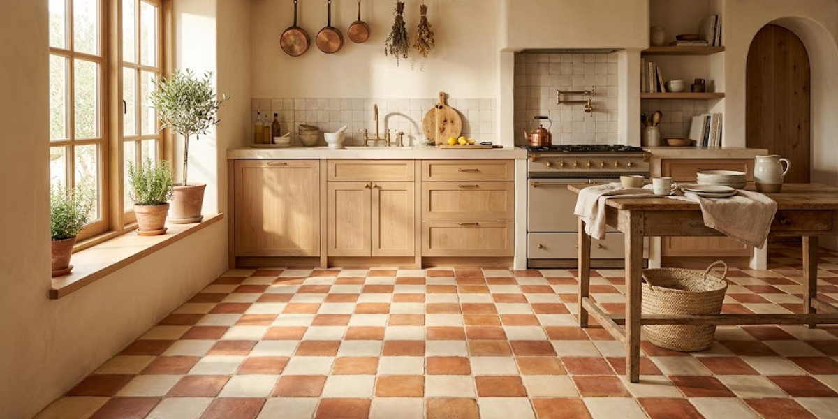

The checkerboard floor is among the most recognizable patterns in architecture. Alternating squares of contrasting color have appeared in buildings for centuries, from ancient Roman temples to twentieth-century diners. For most of that history, the palette shifted with the available materials. Only in recent decades did black and white become the assumed default.
That assumption deserves scrutiny. The checkerboard is a system — a visual rhythm built on alternation. The system works with any two colors that offer sufficient contrast. Locking it into a single pair of hues ignores the pattern's extraordinary adaptability. For anyone undertaking a renovation or new construction, the question is not whether to use a checkerboard, but which pair of colors will serve the room best.
When Black and White Misses the Mark
There are rooms where black and white works precisely as intended. A grand foyer with soaring ceilings and decorative plasterwork can handle the drama. A vintage-inspired kitchen with retro appliances benefits from the historical reference. In these contexts, the bold contrast amplifies the room's existing personality.
The problem emerges in spaces that lack those features. Most contemporary homes have standard eight-foot ceilings, clean lines, and furnishings that skew neutral. Against that backdrop, a high-contrast checkerboard can feel like it belongs to a different building entirely. Introducing color bridges the gap. It allows the floor to feel integrated with the room rather than imposed upon it. Warm tones create a welcoming foundation. Cooler hues establish a calmer, more composed atmosphere. The structural benefits of the checkerboard remain untouched.
Terracotta and Cream
Few color pairings feel as naturally rooted as terracotta and cream. Terracotta carries the warmth of the earth itself — a hue shaped by fire and clay that has lined floors across the Mediterranean, North Africa, and South America for millennia. Cream provides the counterbalance, brightening the combination without introducing coldness.
The appeal deepens in rooms that see daily foot traffic. Kitchens, mudrooms, and hallways all benefit from the forgiving nature of warm earth tones, which mask the dust and debris of everyday life far better than monochrome alternatives. Natural variation in terracotta production ensures that no two tiles are precisely alike, giving the checkerboard an organic, handmade character. A ceramic tile shop will typically stock several varieties of terracotta, from glazed finishes that simplify cleaning to unglazed options that preserve a more tactile, matte surface. Each finish subtly shifts the personality of the pairing.
Deep Navy and White
Navy blue offers something that black cannot: depth without absolute darkness. It anchors a room with weight and presence, but it does so with a warmth that black lacks. Against white, navy creates a checkerboard that is crisp, clean, and structured — familiar enough to feel safe, different enough to feel considered.
This pairing excels in rooms where brightness and cleanliness are priorities. Bathrooms, laundry rooms, and mudrooms all benefit from the navy tile's ability to hide marks, while the white tile reflects light and maintains an open feeling. Navy and white mosaic floor tiles work especially well in compact spaces, where the defined pattern helps establish the floor plane without visually shrinking the room. Keep the walls simple and the fixtures understated. The floor does not need competition.
Sage Green and Off-White
The growing preference for muted, nature-inspired colors in interiors has positioned sage as one of the most versatile greens available. It carries enough pigment to read as a color but remains subdued enough to function as a near-neutral. Combined with off-white, it produces a checkerboard that is calm, continuous, and quietly beautiful.
The distinction between off-white and pure white is important here. Pure white would create a sharper boundary between tiles, emphasizing the grid's geometry at the expense of the palette's softness. Off-white blends more readily with the sage, producing a surface that feels less like a rigid pattern and more like a textured textile. This is an ideal combination for spaces that serve functional purposes but deserve more design consideration than they typically receive — pantries, utility rooms, and small bathrooms. The floor quietly elevates the room without demanding center stage.
Mustard Yellow and Charcoal
Boldness requires a framework, and the checkerboard provides one. Mustard yellow is saturated, warm, and unapologetically expressive. It carries the brightness of pure yellow but tempers it with earthy brown undertones that prevent it from feeling garish. Charcoal absorbs the surplus energy, offering the eye a place to rest between each vivid square.
The success of this combination depends on context. In a large, open space, the pairing can dominate the room and compete with every other element in it. In a smaller setting — a hallway, a guest bathroom, a compact entry — it becomes a concentrated burst of personality that gives the room its identity. The grid contains the color. The color enlivens the grid. That productive tension is what makes this pairing work when the scale is right.
Dusty Rose and Soft Gray
Not every floor needs to draw attention. Dusty rose and soft gray create a checkerboard that achieves the opposite — a pattern that recedes into the architecture and lets the rest of the room take precedence. The pink is deeply muted, functioning more as a warm neutral than a conventional color. Against gray, the alternation is subtle enough that the pattern reveals itself gradually.
This approach suits rooms where calm and comfort matter most. Bedrooms benefit from the warmth without the stimulation. Dressing areas and walk-in closets gain a sense of refinement. In open-plan living spaces, the low-contrast floor provides a continuous visual base that ties different functional areas together. It is a choice driven by long-term satisfaction rather than immediate impact, and that patience tends to reward the person who lives with the floor every day.
Making Smart Choices During the Process
Material Selection Should Follow Function
Color determines how a room feels. Material determines how long that feeling lasts. Porcelain, with its density and resistance to water absorption, is the preferred choice for bathrooms, kitchens, and any space exposed to moisture. Ceramic, lighter and easier to cut, works well in drier areas where installation simplicity matters. When evaluating options at a ceramic tile shop, ask about the PEI rating system, which classifies tiles by their resistance to surface wear. Tiles with higher ratings withstand more years of foot traffic before showing signs of deterioration. Choosing the right material for the specific room prevents premature replacement and reduces ongoing maintenance.
Grout Influences the Final Outcome
The line between tiles may be thin, but its impact is substantial. With a two-color checkerboard, grout acts as a third design element that either supports or undermines the overall effect. A grout color that falls midway between the values of the two tiles creates an even, balanced grid. Darker grout adds definition and ages well, concealing stains that accumulate over years. Lighter grout keeps the floor feeling fresh and open but demands more frequent cleaning. The most effective approach is to select grout as part of the initial design phase, testing it alongside the tiles rather than choosing it as an afterthought. The goal is a grout color that relates equally to both tile colors.
Lighting Conditions Change Everything
No amount of showroom browsing can tell you how a tile will look in your home. The lighting in retail environments is engineered for maximum product appeal, typically brighter and more even than residential conditions. A terracotta tile may look perfectly balanced under fluorescent panels but shift noticeably warm in a room with afternoon sun. A dusty rose could read as true pink in the store but flatten into taupe under north-facing light. Always bring samples home and place them in the actual room. Check them at different times of day and under different artificial light sources. This single precaution prevents the most common regret in tile selection.
Tile Scale Shapes the Room's Character
The physical size of each square alters the pattern's visual impact. Larger tiles — twelve inches or more — produce a bold, modern checkerboard. The pattern feels open, and the reduced number of grid lines can make a room appear larger. Smaller tiles, particularly the two- and three-inch squares found in mosaic floor tiles, create a more intricate and textured surface. They carry a traditional, European quality that suits detailed interiors. The scale of the room should guide the choice. Spacious areas handle large tiles without losing visual interest. Tighter rooms often benefit from smaller formats that add complexity and richness within limited square footage.
Precision Is Not Optional
The checkerboard exposes installation flaws that other patterns conceal. Because the design depends on the exact alignment of alternating squares, even minor errors — a row that drifts, a joint that varies in width, a pattern that fails to center — become conspicuous. With two contrasting colors, these imperfections are amplified rather than hidden. The essential safeguard is the dry lay, where all tiles are set across the full room without adhesive before the permanent installation begins. This step reveals where cuts will fall at the edges, whether the pattern aligns properly with the room's dimensions, and how the two colors interact at full scale. Allocating sufficient time for this process is the difference between a floor that appears professional and one that appears otherwise.
The Pattern Is Broader Than Its Reputation
The checkerboard has persisted across centuries because it accomplishes something valuable with remarkable economy. It creates visual movement, establishes spatial order, and transforms flat surfaces into something with depth and energy. Those qualities are inherent in the pattern itself, independent of any single color pairing.
Moving beyond black and white does not abandon the tradition. It expands it. Each alternative palette — the warmth of terracotta, the composure of navy, the quietude of sage, the vitality of mustard — preserves the structural elegance that makes the checkerboard work while giving it a voice that reflects personal taste. The grid is the instrument. The color is the melody. When the two are chosen with care, the floor becomes not just a surface to cross but a space that communicates something about the person who made the choice.
Ubicación del Autor
1 Grange Road, Orchard Building #12-02, (Located above H&M), Singapore 239693