
The way a business name appears on a wall can affect how easily people notice and recognise it. Flat printed signs are useful for many purposes, but raised lettering can add another level of depth to a business entrance or interior. 3d letters signage is one option used for company names, shop signs, reception walls, and other commercial spaces.
The letters can be made in different sizes, materials, colours, and finishes. Some are installed without lighting, while others are combined with illumination. The right choice depends on the location, the viewing distance, the design, and the type of surface where the letters will be fixed.
What Makes 3D Letters Different
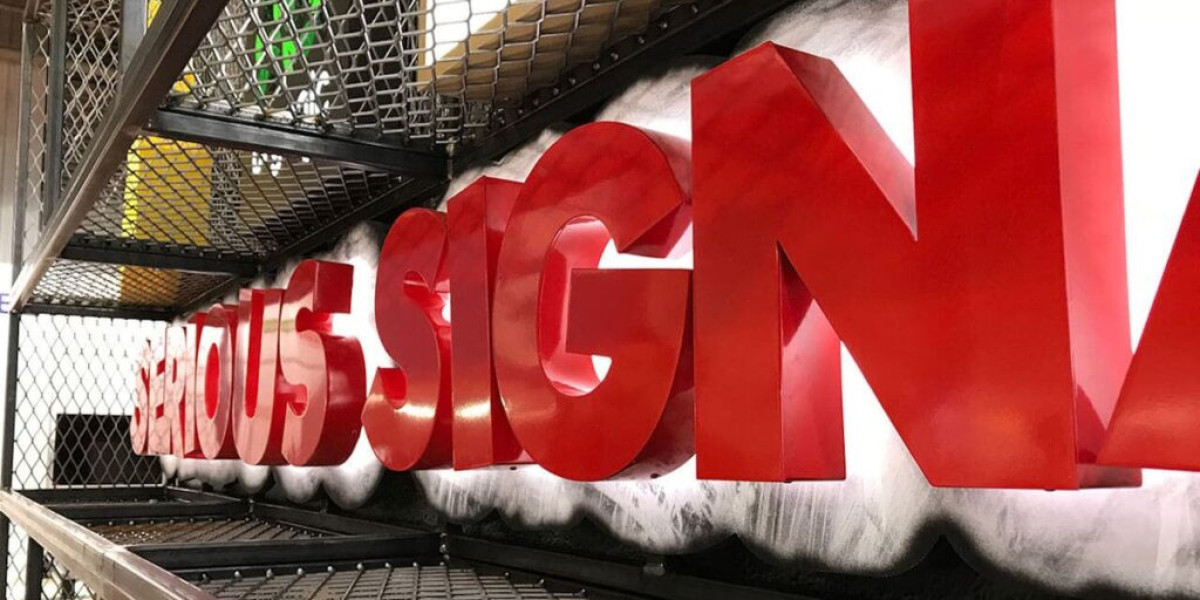
The main difference between 3D letters and flat lettering is depth. Instead of appearing as a printed image on a surface, individual letters are physically raised from the wall.
This creates shadows around the lettering, which can make the name easier to notice. The effect changes throughout the day as the direction of light changes.
Each letter can be produced separately, allowing the spacing and placement to be adjusted during installation. This can be useful when a business name has several words or when a logo needs to be positioned alongside the lettering.
The depth of the letters should be selected according to the size of the sign and the distance from which it will be viewed.
Where 3D Letters Can Be Used
Dimensional lettering is suitable for many commercial settings. It can be installed on exterior walls, shopfronts, reception walls, office entrances, showrooms, hotels, restaurants, and other business locations.
Inside an office, raised letters can identify the company behind a reception desk or on a feature wall. In retail spaces, they can be used above an entrance or behind a counter.
The location affects the material and construction requirements. Outdoor lettering needs to cope with environmental conditions, while indoor lettering can focus more on appearance and the surrounding interior design.
The wall itself should also be considered before installation. Different surfaces may require different fixing methods.
Choosing Materials for Raised Letters
Several materials can be used to produce dimensional lettering. Acrylic is often selected when a smooth, clean appearance is required. Metal can provide a more solid and structured look, while other materials may be selected based on weight, finish, or budget.
The material should match the location. Lightweight materials can be useful for certain interior applications, while exterior signs may need stronger construction.
Surface finishes can also change the appearance of the letters. Glossy surfaces reflect more light, while matte finishes tend to create a softer look.
The colour of the letters should provide enough contrast with the wall behind them. This helps the business name remain readable rather than blending into the background.
How Lighting Changes 3D Lettering
Lighting can make raised letters more noticeable, particularly in areas where a business operates after dark. There are several ways lighting can be combined with dimensional letters.
Front lighting can illuminate the face of the letters directly. Backlighting creates a glow behind the letters, producing a softer outline around each character.
Halo lighting is one example of backlighting. Light spreads from behind the letter and creates a glow on the wall surface.
Lighting should be planned together with the depth and placement of the letters. If the gap between the letters and wall is unsuitable, the light may not spread evenly.
For outdoor installations, electrical components should also be protected appropriately and installed according to the requirements of the location.
Why Letter Spacing Matters
Even well-made letters can be difficult to read when they are positioned incorrectly. Spacing should be planned before production rather than adjusted randomly during installation.
Letters placed too close together can make words appear crowded. Excessive spacing can make the name look broken into separate parts.
The shape of individual letters also affects spacing. A narrow letter may need different spacing from a wide letter, while rounded characters can create different visual gaps.
The full business name should be viewed as one design rather than as a collection of separate letters. This helps maintain a balanced appearance across the wall.
Selecting the Right Size
The size of the lettering should match the viewing distance and available space. A small reception sign can use smaller letters because visitors are standing close to it.
An exterior sign above a building entrance may need larger letters because people will see it from the street or from across a parking area.
The wall dimensions should also be measured carefully. Letters that are too large may overpower the building, while very small letters may not attract enough attention.
The position of logos and other elements should be considered at the same time. A logo that is too close to the lettering can make the design feel crowded.
What to Look for in a Professional Signage Company in Dubai
Choosing a professional signage company in Dubai involves more than comparing finished designs. The company should understand the practical side of producing and installing dimensional signs.
Material knowledge is important because different materials behave differently during cutting, finishing, transport, and installation.
Measurement and installation are also important. Small mistakes in spacing or alignment can become obvious when several large letters are installed across a wall.
A suitable signage provider should also be able to discuss the installation surface, fixing method, lighting requirements, and expected environmental conditions.
Reviewing examples of previous dimensional lettering can help a business understand the type of finish and construction available.
Preparing a Wall Before Installation
The condition of the wall can affect the final result. Dust, loose paint, uneven surfaces, or damaged areas may make installation more difficult.
Before the letters are fixed, the installation area should be measured and marked. This helps maintain the correct alignment and spacing.
Templates can be useful when many individual letters need to be positioned along one line. They help installers maintain consistent placement.
The fixing method should suit both the letters and the wall. Heavy letters may need stronger support than lightweight indoor lettering.
Taking care of these details before installation can reduce alignment problems later.
Maintaining 3D Letters Over Time
Dimensional letters are exposed to the same surroundings as the building where they are installed. Outdoor signs may collect dust, while indoor signs can develop marks from regular contact or nearby activity.
Regular cleaning helps keep the letters visible and maintains their finish. Cleaning methods should be suitable for the material so that the surface is not scratched or damaged.
Illuminated letters need additional checks. If one section becomes darker than another, the lighting components may need inspection.
Outdoor installations should also be checked for loose fittings or signs of surface wear. Early maintenance can help prevent a small issue from affecting the entire sign.
Zahrat Al Madina Printing is one Dubai-based printing and signage business that may work with dimensional lettering and other commercial signage applications.
Final Thoughts
3d letters signage can give a business name more depth and make it stand out from a flat printed design. Its appearance depends on several details, including the material, letter size, spacing, finish, lighting, wall surface, and installation method.
The right design does not always need to be complicated. Clear lettering with suitable spacing and good contrast can communicate a business name effectively in both indoor and outdoor settings.
When choosing a professional signage company in Dubai, it is useful to consider its experience with materials, measurements, installation, lighting, and different wall surfaces. Proper planning from the beginning can help the finished lettering look balanced and remain useful for a long time.
Ubicación del Autor
Umm Ramool - Dubai - United Arab Emirate